
ALMATY, KAZAKHSTAN
HOSPITALITY
Hit play before diving into the case


ABOUT THE PROJECT
GRUPPO 63 is a cocktail bar located in the heart of Almaty, inspired by the Italian neo-avant-garde movement Gruppo 63 and the aesthetics of Federico Fellini’s 8½.
BRAND-STRATEGY
ITALY 60S–70S
NEO-AVANT-GARDE
ART
EXPERIMENTAL
INNOVATION
3
6
9
1
................"Gruppo 63" is inspired by the name of a literary group formed in Italy in 1963. It brought together a number of young Italian writers and critics who were dissatisfied with traditional Italian literature and sought its renewal and innovation.
The project brings together Italian culture of the 1960s–70s, an experimental approach to mixology, and the idea of a bar as an intellectual and cultural space.

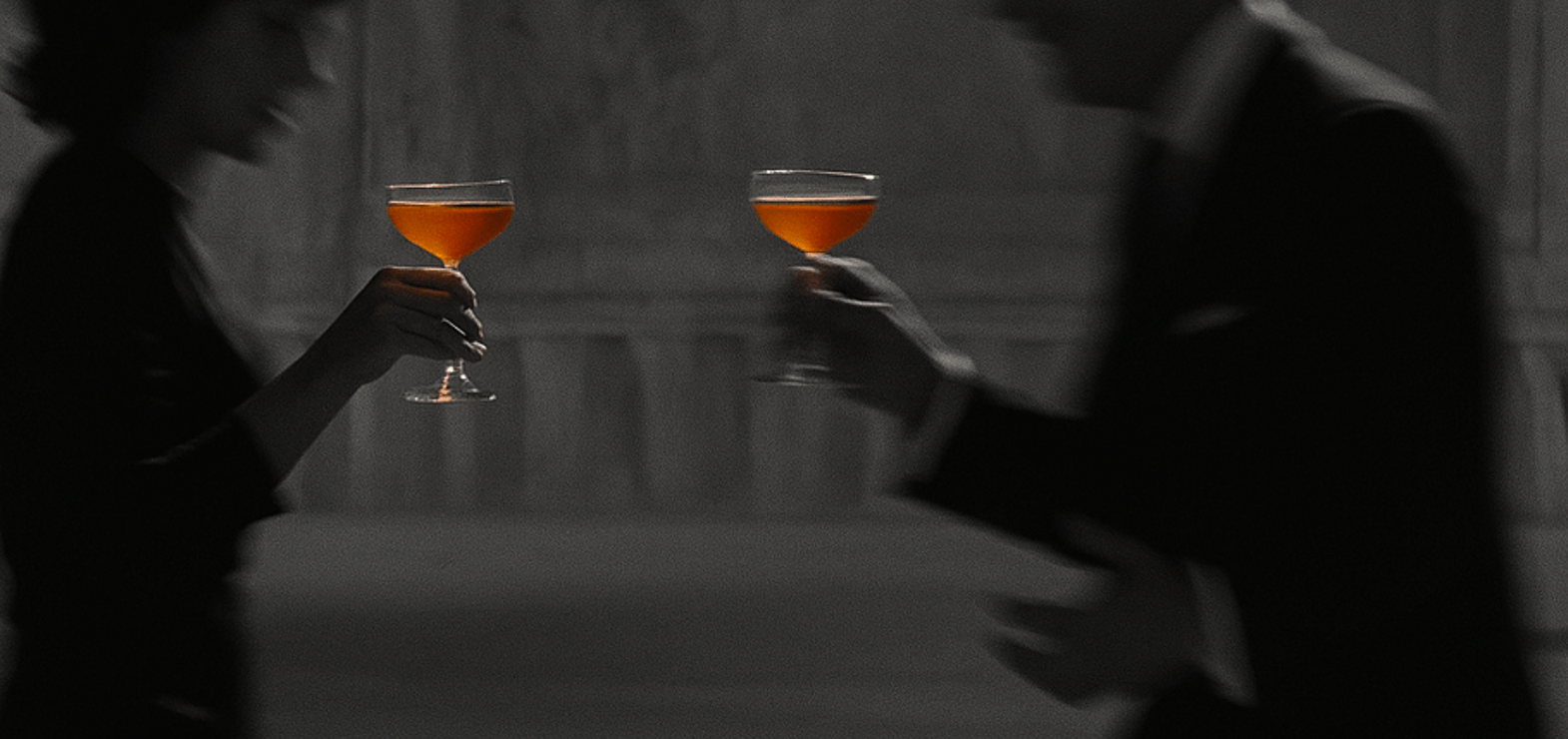
Signature Negroni
At the center of the concept stands Negroni — a classic reimagined through innovation
LA NOTTE DI NEGRONI
CONT. 150 ML
BASE:
LONDON DRY GIN
SWEET VERMOUTH
BITTER APERITIVO
NOTES:
BLOOD ORANGE
DRIED CHERRY
WARM SPICES
ORANGE ZEST OIL
PROFILE:
BITTER & AROMATIC
SERVE:
ON ICE, LOW GLASS
ORANGE ZEST,
DRIED CHERRY
LEVEL:
BITTER ●●●●○
SWEET ●●○○○
STRONG ●●●●○
VOL. ALC. 22%
The project team approached us at the concept development stage of the bar. The goal was not simply to create a new venue, but to develop a deep brand platform that:

1
Defines the meaning and philosophy of the project
2
Builds a community around the bar
3
Is reflected in the interior, product, communication and operational decisions
1
To create a distinctive cocktail bar concept, different from classic and mass-market formats
2
To build a strong brand platform rooted in culture, art, and experimentation
3
To design a cohesive guest experience — from the first touchpoint to time spent in the space
4
To lay the foundation for future growth and brand scalability
1
Research the market and global references in cocktail bar culture
2
Define positioning and target audience
3
Shape the BIG IDEA, brand mission, values, and character
4
Develop the communication strategy and Tone of Voice
5
Unpack the product (the bar, cocktails, Negroni as a symbol)
6
Set a clear direction for branding, interior, and operational marketing
Our Process
- analysis of the cocktail bar market and cultural spaces,
- benchmarking international references (The Connaught Bar, L’Antiquario, Sotto, Apollonia, and others)
- research into the target audience, their motivations and barriers
- positioning development
Result: a clear understanding of the project’s niche and potential.
We began with deep immersion into the project:
- BIG IDEA: A Taste for Life
- Mission: to create a space for freedom of thought, experimentation, and connection
- Values: innovation, honesty, individuality, community
- Brand archetype: The Explorer
- Character: free, bold, open, adventurous
Based on the research, we developed the brand platform:
- key message: Step beyond the ordinary
- Tone of Voice: confident, free, intellectual, without formality
- communication scenarios for social media, media, and offline
- collaboration and influencer marketing ideas
We built a clear logic for brand communication:
- Negroni developed as a “canvas for experimentation”
- variations inspired by Italian culture of the 60s–70s
- ideas for standout presentation, storytelling, and menu structure as an extension of the concept
Negroni was chosen as the flagship cocktail and the brand’s symbolic core.
- neo-avant-garde aesthetics and Italian modernism
- mosaic, vintage elements, and Negroni tones as visual codes
- recommendations for staff uniforms, menus, details, and décor
- the interior as a continuation of the brand philosophy
We defined the visual and spatial direction of the brand:
- Private alcohol lockers in the cigar room — a symbol of exclusivity and personalized service for regular guests
- Closed Telegram community — for private event announcements, special offers, and building an inner circle
- Intimate events and collaborations — tastings, art evenings, and music formats as a continuation of the brand philosophy
- Negroni as a creative code — limited editions, special serves, and storytelling around the flagship cocktail
Result:
The bar moves beyond a classic format, forming a strong community where marketing works through meaning, emotion, and a sense of belonging.
We developed creative solutions that strengthen the GRUPPO 63 brand through experience and engagement rather than direct advertising.


Overall Results
4
A solid foundation for a long-term, scalable brand
3
One cohesive direction for product, interior, communication, and service
2
Clear positioning with a strong cultural foundation
1
A fully developed brand platform for the cocktail bar
BRANDING VISION
The visual identity of GRUPPO 63 is conceived as a cultural statement — expressive, tactile, and rooted in the aesthetics of Italian neo-avant-garde.
Every branding element reflects the project’s philosophy: experimentation, art, and a true taste for life.
BRANDING

COLOR PALETTE
The GRUPPO 63 color palette is intentional — each tone carries meaning.
................ Warm, saturated, and bold, it represents the heart of the brand: taste, ritual, and Italian cocktail culture.
of Negroni
THE COLOR
ORANGE

1
COLOR PALETTE
The GRUPPO 63 color palette is intentional — each tone carries meaning.
................ It evokes ice, metal, and restraint, balancing the warmth of orange while adding depth and elegance.
A DELIBERATE CONTRAST
COLD GREY

2
COLOR PALETTE
The GRUPPO 63 color palette is intentional — each tone carries meaning.
................ It references vintage paper, stone, and classic interiors, grounding the identity and connecting it to history and materiality.
A SOFT NEUTRAL TONE
BEIGE

3
TYPOGRAPHY PLAYS A CENTRAL ROLE IN THE GRUPPO 63 IDENTITY

Base & Bloom is used as the primary display typeface. Its expressive forms and alternative glyphs echo Italian posters and avant-garde publications. The typeface allows for bold compositions and serves as a strong visual accent in headlines.
1

Mono Condensed C is used for body text. Functional and highly legible, it brings structure to longer formats such as menus, descriptions, and printed materials.
2

Crystal Sky is a handwritten typeface used for accents. It adds a human, intimate touch like a signature or a personal note.
3
The typographic system reflects the brand’s duality: freedom of expression paired with thoughtful structure.
GRAPHIC ELEMENTS & PATTERNS
A bar spoon was selected as a key decorative element like a symbol of mixology.

“G” SYMBOL
Based on this element and the “G” symbol, custom patterns were developed. They create rhythm, repetition, and visual texture, reinforcing the sense of ritual and process behind the bar.

Coffee cup
THESE PATTERNS ARE APPLIED ACROSS PACKAGING, PRINTED MATERIALS, AND INTERIOR DETAILS, BECOMING AN INTEGRAL PART OF THE BRAND’S VISUAL LANGUAGE.


BRAND IN SPACE
The identity was designed to seamlessly exist within the interior.
Staff uniforms — reference classic Italian elegance and cinematic imagery. Menus, posters, signage, and outdoor applications follow a unified visual logic. Monochrome photography combined with brand colors enhances contrast and focus.


THE BRANDING BECOMES PART OF THE SPACE, REINFORCING THE PROJECT’S PHILOSOPHY THROUGH EVERY DETAIL.


Results
3
A flexible system working across print, digital, and interior environments
2
A strong connection between product, space, and communication
1
A recognizable, culturally grounded image
The brand speaks through form, color, and texture creating an impression built on meaning.
The GRUPPO 63 identity became more than a visual system, it evolved into a strategic brand tool:
Project Team
NIKITA KOLMOGOROV — Brand Designer
ANNA VOROSHILOVA — Brand Strategist
ALENA KRASATULINA — Interior Designer
YULIYA YERMOLAYEVA — Head of Marketing
DMITRY ILYUK — CEO
ALEXEY KIM — Co-founder
NIKOLAY POZDEYEV — Co-founder
YANA KURNIKOVA — Head of Project
ALENA KRASATULINA
Interior Designer

YULIYA YERMOLAYEVA
Head of Marketing

DMITRY ILYUK
CEO

ALEXEY KIM
Co-founder

NIKOLAY POZDEYEV
Co-founder

NIKITA KOLMOGOROV
Brand Designer

ANNA VOROSHILOVA
Brand Strategist

YANA KURNIKOVA
Head of Project

NEW YORK
DUBAI
PARIS
ART
WELLNESS
FASHION
HOSPITALITY
©Lune Buro, 2026
ASTANA