

ALMATY, KAZAKHSTAN
HOSPITALITY

Hit play before diving into the case



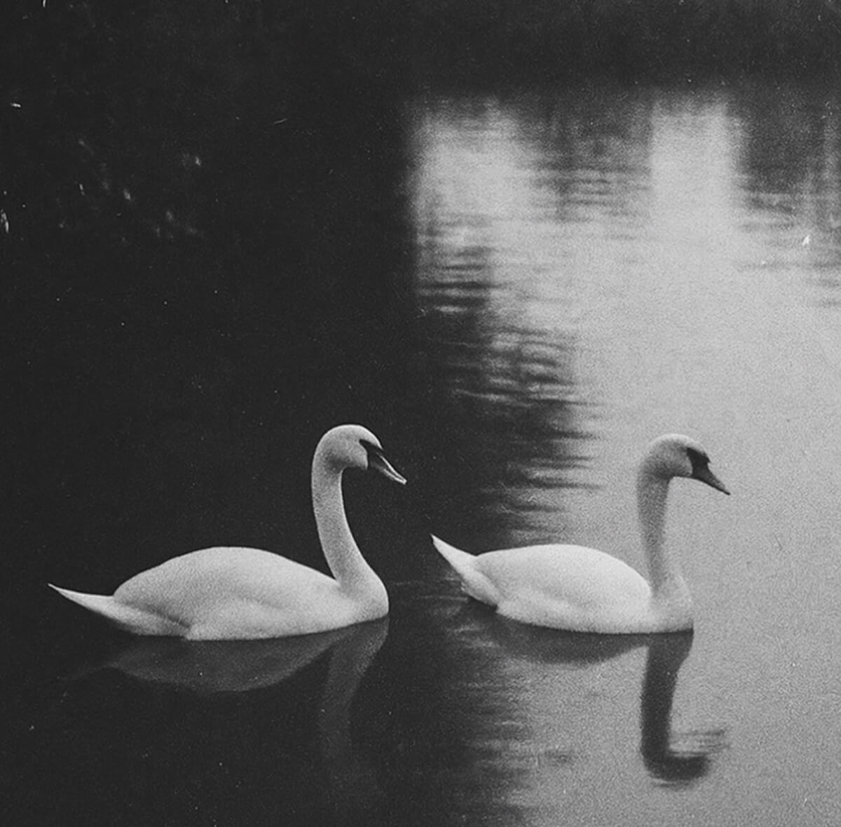
In the past, it was a meeting place for the city’s writers, musicians, artists. Swans in the pond, ice cream served in glass bowls, Turkish coffee, a summer terrace, and the feeling that time was slowing down.
Our task was to create a contemporary urban space that preserves this cultural memory and makes it relevant for a new generation while also bringing nostalgia to those who remember the café as it once was.


AKKY is the revival of the legendary café “Akku”, which existed in Almaty in the second half of the 20th century
BRAND-STRATEGY
RELAXATION
INSPIRATION
CREATION
NOSTALGIA
INTELLIGENTSIA

Key Objectives
Project Goals
Build a strong foundation for PR and marketing launch
Develop the product, interior and communication concept
Create a complete brand platform (Big Idea, mission, values, brand persona)
Identify target audiences and their motivations
Rethink historical legacy through a modern format
Define a clear strategic positioning based on the existing cultural heritage
Context & Challenge
The project was at the early concept stage
It was important to build not just a restaurant concept, but the cultural code of the new “Akku”
We faced a complex strategic challenge:
- preserve the historical value of the place
- avoid direct “Soviet-style” imitation
- create a modern product with strong emotional depth
- connect nostalgia with a relevant contemporary food format
Integrate strategy into interior, service and packaging
Develop the Tone of Voice
Create the menu and product logic
Define the project’s Big Idea
Develop 5 audience segments
Study cultural and gastronomic benchmarks
Conduct deep historical research
Our Approach
- the history of Café Akku
- the “glass café” phenomenon of the 70s
- iconic cafes and restaurants of Almaty
- the cultural environment of the city’s intellectual community
Result: we identified a strong strategic foundation – Akku as a meeting point of generations and the cultural memory of the city.
We analyzed:
We studied archival materials, local memories, articles and cultural sources.
- restaurants with strong cultural DNA
- concepts rooted in historical context
- spaces with an intellectual atmosphere
This helped us define the right tone and depth for AKKY.
We explored projects that balance history and modernity:
- inspiration
- nostalgia
- creativity
- ease
- contemporary interpretation
Result: the project gained a clear character and emotional framework that shapes the entire guest experience.
Core meanings:
Mission:
To connect history and modern life by creating a space for slowing down, reflection and meaningful meetings.
AKKY is a place where guests feel connected to the cultural and gastronomic traditions of the past, but within the comfort and aesthetics of today.
Harmony Between History and Modernity
- “Time Machine Menu”
- nostalgic desserts
- cocktails named after cultural references
Result: a flexible product system that unites heritage with contemporary gastronomy.
Creative elements included:
- breakfast concept
- main menu
- desserts
- bar menu
- artisan bread line
- coffee concept
- curated local brand shop
We created:
We developed a Comfort Food format with a modern interpretation of local and European dishes.
- verbal strategy
- non-verbal service principles
- Instagram concept
- content structure
- interview ideas with local residents
- PR and media strategy
- influencer matrix
- collaboration system
Result: AKKY received a full storytelling launch model, not just a social media presence.
We developed:
- mid-century modern + Soviet modernism
- strong connection with nature (waterfront location)
- retro details without imitation
- local art integrated into the space
Result:
The interior became a continuation of the strategy — not a separate design decision.
We defined the strategic direction for design:
Global Results
The project gained a strong cultural foundation for its restaurant concept / Historical heritage was reinterpreted without clichés or stylization / A cohesive system was created: strategy, product, interior and communication / AKKY became a true symbol of the revival of a city legend


BRANDING
Visual Concept
The AKKY identity is built on a reinterpretation of Almaty’s architectural and cultural heritage of the second half of the 20th century.
We did not create a “retro design”, but reconstructed the cultural code of the era through a contemporary graphic language. At the core lies post-Soviet modernism, re-read and reimagined for today.

The patterns feature a minimalist design and a modern take on the retro palette, using ochre, dusty blue, cream, and natural green accents.
The patterns are inspired by abstract forms and architectural details of Almaty’s Soviet modernism, including the Kazakhstan Hotel façade, the Opera and Ballet Theatre, bridges, textures, and geometric elements of the period.
Patterns
and Graphics
Contemporary Interpretation
Historical References


We preserved:
- the geometry of the lines
- the layered typography
- the character of the era
Logo
The return of a sign
At the same time, we made it more precise, graphic and contemporary. The logo is built on clear parallel lines, referencing the architectural plasticity of post-Soviet modernism.
The AKKY logo is a reconstruction of the original sign that once appeared on the façade of the legendary glass café.


Emblem:The Swan
“Akku” means “white swan” in Kazakh. The swan symbol existed in the café’s history, but we chose not to make it romantic or decorative.
It reflects the granite aesthetics of modernism and the sharp lines of urban architecture.
MONUMENTAL
GRAPHIC
ALMOST CARVED IN STONE
STRICT

PANTONE 7407 C
The colors were chosen with intention.
- Blue represents the water of the lake where the swans once lived
- Ochre reflects the tones of façades and the retro palette of the 70s
- Natural green connects to the park area and surrounding nature
- Cream and warm black bring balance, intelligence and timelessness
Color Palette
Era & Water
The palette echoes the era while remaining fresh and contemporary.
Typography:
The City in Letters
Futura New
An iconic constructivist typeface.
It adds clarity, structure and intellectual depth. Its geometric forms create a timeless, precise and sophisticated visual language.
MB Druzba
A historical grotesque typeface from the 60s with eclectic geometry. Used for headlines and accent typography. It carries the bold spirit of the modernist era.
Typography is one of the key cultural elements of the brand.


The patterns and graphic rhythms are inspired by iconic buildings of Almaty — including the Hotel Kazakhstan, the Opera and Ballet Theatre, and other architectural landmarks.
Letters here are not just typography — they continue the language of the city’s architecture.


Abstract forms are interpreted in a minimalist way.
- STRUCTURE
- RHYTHM
- ARCHITECTURAL MEMORY
- MOSAICS
- METAL CONSTRUCTIONS
- FAÇADE GEOMETRY OF SOVIET POSTMODERNISM
Patterns
Architecture
in Graphics
They create a sense of:
The graphic patterns are inspired by:
Packaging
Branded materials continue the concept
of strict geometry.
Forms and lines refer to the constructive logic of the era, translated into modern minimalism.
The identity system is flexible – scalable across digital, print and spatial applications.


PROJECT TEAM
Result
It is an intellectually refined reconstruction of a legend, reimagined through a contemporary visual language.
The AKKY identity became:
- a cultural bridge between generations
- a contemporary interpretation of a historic sign
- a visual system integrated into the city’s architectural context
- a tool for building recognition and character
YULIA YERMOLAYEVA
Head of Marketing

DMITRY ILYUK
CEO

SOFIA
Graphic Designer

NIKITA KOLMOGOROV
Brand Designer

ANNA VOROSHILOVA
Brand Strategist

YANA KURNIKOVA
Head of Project
